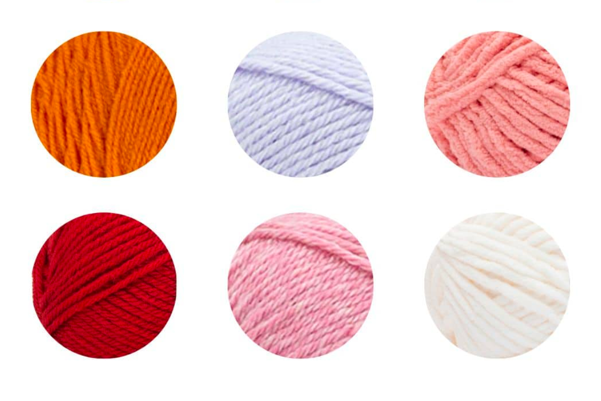
One of the key aspects of creating visually appealing granny squares is selecting the right color palette.
Color theory can be a daunting subject for some, but with a few basic principles in mind, anyone can learn how to choose the perfect color palette for their granny square projects.
How To Pick Colors For Granny Squares
Follow along with the steps below to learn how to pick yarn color combinations for your next granny square project.
Understanding Color Theory
To understand how to pick the perfect color palette for your granny square patterns, it’s important to have a basic understanding of color theory.
The color wheel is a useful tool that can help you understand how different colors work together. The three primary colors are red, yellow, and blue.
Color Wheel
Secondary colors are created by mixing two primary colors together: orange (red + yellow), green (yellow + blue), and violet (blue + red).
Tertiary colors are created by mixing a primary color with a secondary color.
Using the Color Wheel to Create a Palette
When picking a color palette for your granny squares, it’s a good thing to consider the mood or feeling you want to convey. For example, warm colors like red, orange, and yellow can create a feeling of energy and excitement, while cool colors like blue, green, and violet can create a calming and relaxing effect.
Analogous colors are colors that are next to each other on the color wheel, and they can create a harmonious and cohesive palette. For example, yellow, yellow-green, and green are all adjacent on the color wheel and can create a cohesive and calming palette.
Complementary colors are colors that are opposite each other on the color wheel, and they can create a vibrant and energetic palette. For example, red and green are complementary colors, and using them together can create a bold and striking effect.
You may want to invest in a color wheel or color wheel poster to have on hand so when you pick colors you can be sure they work well together.
Incorporating Neutrals
While colors are an important part of any granny square project, it’s also important to incorporate neutrals such as black, white, and gray.
Neutrals can help to balance out bright or bold colors and create a cohesive overall look. For example, a neutral beige or gray can help to tone down a bright pink or orange.
Playing with Contrast
Contrast is another important aspect of creating a visually appealing color palette.
High contrast can create a bold and striking effect, while low contrast can create a more subtle and harmonious look. For example, using a bright yellow and a deep purple together can create a high contrast effect, while using different shades of pink and red can create a low contrast and more subtle effect.


Leave a reply